Shea Futral
MBA 8011
Spring 2002
Project Report 1B: Descriptive Statistics
In this project we’ll look at at some of the most frequently used numerical summary measures. These include measures of central location, measures of variability, and measures of association. After gaining an understanding of these measures and how they can be of usefulness, we will look at some ways that we can visually, or graphically, illustrate these summary measures.
Mean – the mean is the average of all values of a variable. Or more simply, it is the “expected” given a set of related observations. The mean can be fairly representative if the distribution of values is symmetric. However, the mean is often misleading because of skewness. Outliers, abnormally large or small values relative to the majority, can make the mean unrepresentative of the group.
Median – the median is the middle observation when data is listed from smallest to largest. With an odd number of observations it is the exact middle observation. In an even numbered data set, it is the average of the two middle observations. When you are looking for a more representative “middle of the road” value for a given data set with large or small outliers, the median is a better choice than the mean.
Mode – the mode is simply the most frequently occurring value. The mode is practically useless if your data set consists of single occurrences. However, if you are a pattern of frequently recurring values, the mode can be helpful
Variance – The variance is the measure if the squared deviations from the mean. The large the variance, the more variability there is about the mean.
Standard Deviation – the square root of the variance. This is often preferred measure over the variance because it is expressed in original units (rather than squared units).
Correlation and Covariance – Each of these measures the strength (and direction) of a linear relationship between two numerical variables. Since we are talking about “linear” relationships, you can picture the variables falling on an X,Y axis in a scatterplot. The relationship is strong is the points cluster tightly around a straight line. It the line rises from left to right, then its is said to be positive. If the line falls from left to right, it is said to be negative.
Covariance – is essentially an average of products of deviations from means. The limitation of covariance as a descriptive measure is a that it is affected by units in which X and Y are measured.
Correlation – is a unitless quantity that is gotten from dividing the covariance by the product of the standard deviations. The correlation is always between –1 and +1. The closer its is to either, the closer the points in a scatterplot are to some straight line. If the correlation is closer to 0, then the scatterplot is typically a “cloud” of points with no apparent relationship.
These are the sales descriptive statistics for my team and my top rep over a 24 week period. This period may or may not be a good representation of the entire sales year. The sample is from 8/26/01 to 2/3/02. It is not determinable from these statistics necessarily that newspaper subscription sales are seasonal, however it may be useful in planning and forecasting.
|
Rep:
Aaron |
|
|
Team:
Shea |
|
|
|
|
|
|
|
|
Mean |
45 |
|
Mean |
148 |
|
Median |
45 |
|
Median |
141 |
|
Mode |
49 |
|
Mode |
141 |
|
Standard Deviation |
18.76 |
|
Standard Deviation |
37.41 |
|
Sample Variance |
351.85 |
|
Sample Variance |
1399.24 |
|
Range |
65 |
|
Range |
144 |
|
Minimum |
11 |
|
Minimum |
82 |
|
Maximum |
76 |
|
Maximum |
226 |
|
Sum |
1083 |
|
Sum |
3549 |
|
Count |
24 |
|
Count |
24 |
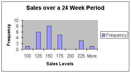
This graph shows that the most common range in sales over the last 24 weeks has been between 150 and 175 sales. Only three times has the team production been over 200 sales on a weekly basis. That shows us that there has been problems attaining the goal of at least 200 sales per week.
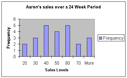
This chart shows us Aaron’s sales. Aaron is the most productive member of the team. The vast majority of his sales has been over 40 on a weekly basis. We can safely say that Aaron has been performing well above the average. It looks as if Aaron, being only one tenth of the team, is bringing in around a quarter of the total team sales.
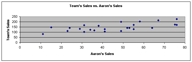
We can manipulate the appearance of a relationship of descriptive statistics by stretching and reshaping graphs. Looking at this graph, it is tough to tell if there is a significant relationship between Aaron’s sales and total team sales.
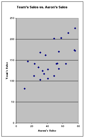
Looking at the same graph, but streached in a different way makes it apparent that Aaron’s sales and total team sales are related in a linear fashion. As Aaron’s sales increase so does total team sales and vice versa. There are no major outliers in this graph.
Here, we tracked both Aaron’s sales and total team sales. As you can easily see, there is a strong relationship. It would seem that as Aaron’s performance increased over the last couple of weeks, so did the team’s.
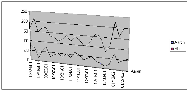
The conclusion is that descriptive statistics help us determine relationships. The information gathered by this process is crucial in decision-making. By the use of the statistics represented here, I can see that the team’s overall performance may be to heavily dependant upon the success of a single representative. However, other factors such as the strength of the schedule and possibly weather may affect both the team and Aaron’s sales. This would suggest that the success of the team is not dependant upon Aaron’s success, but that his success significantly does improve team performance.